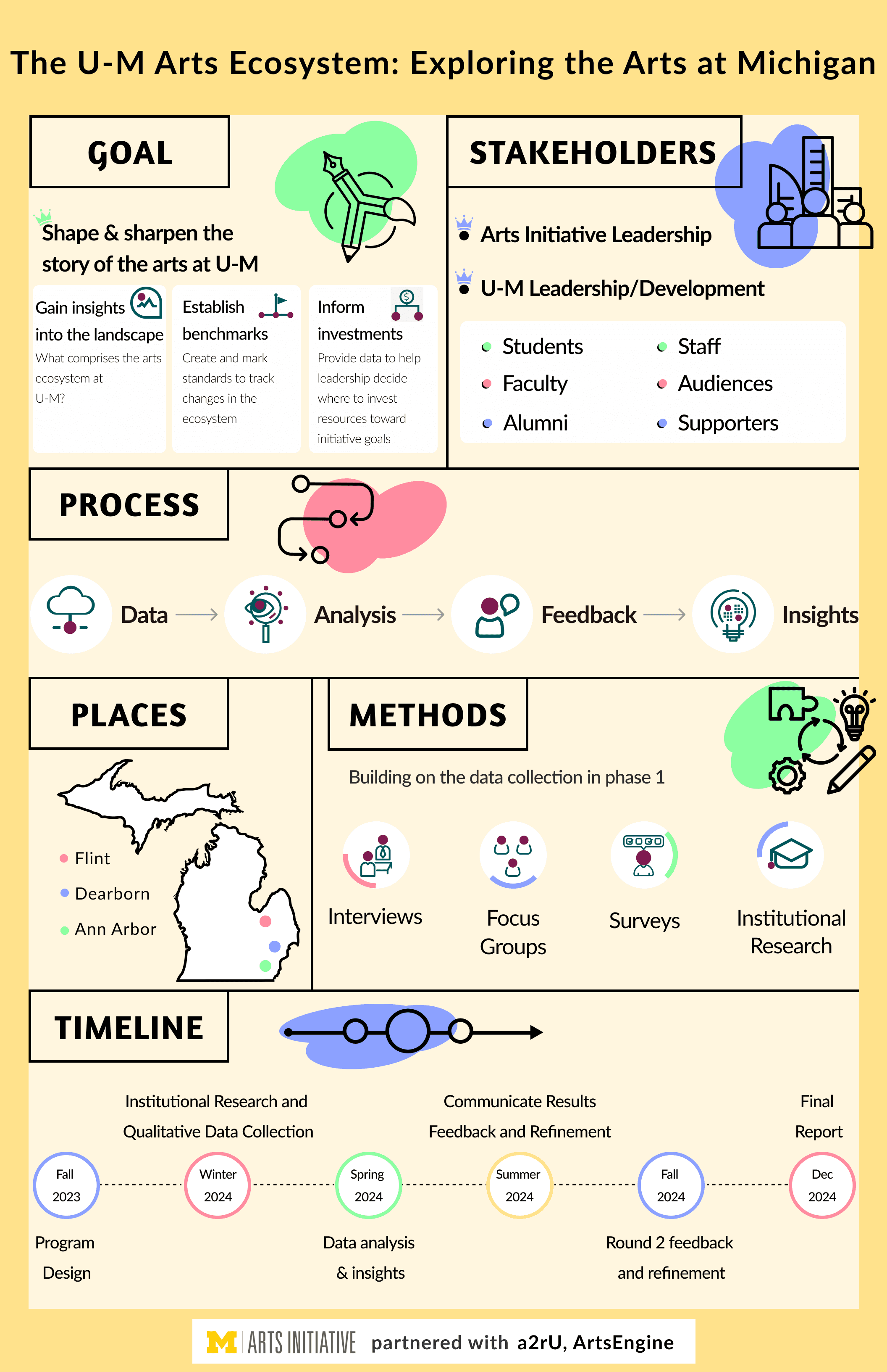
Poster for the Arts Initiative
Task
I was tasked with designing a poster for the Arts Initiative to represent the current state of the arts at Michigan and outline our plans for the upcoming year. The Arts Initiative provided the data, and my role was to transform it into an infographic for presentation to upper management.
Requirements
Infuse the poster with an artistic flair to reflect its representation of an arts organization.
The design needs to incorporate reusable icons for A2RU (The Alliance for the Arts in Research Universities) that could be repurposed for future use.
Approach
My initial approach was to narrow down the scope, as the poster could have taken various directions. I aimed to strike a balance between professionalism and playfulness, incorporating elements that reflect both while blending them seamlessly.
Components
The color wheel
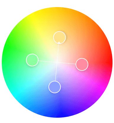
The color wheel was applied using a square complementary combination, selected for its ability to create a visually balanced and vibrant aesthetic. This set of lively colors offers a harmonious yet dynamic contrast, perfectly aligning with the organization's tone and energy.
#FF8CA0
#8CA1FF
#FFE28C
#8CFFA1
The elements
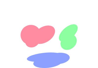
The area covered by the stroked ranged from null to a full stroke depending on the section it was used in
The bullet points were given an extra highlight to add playfulness
Icons near headings have colored patches to indicate that the icons were drawn outside the line, just like how art breaks boundaries and expands
The grid
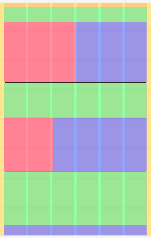
To ensure a consistent and visually harmonious design, I implemented an 8px grid system across the entire interface.
The layout was structured using a 6-column grid, which allowed for flexible and responsive design variations.
Additionally, a hierarchical layout approach was employed to effectively organize content
The icons
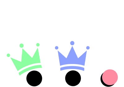
Given the need to reuse the icons across other A2RU documents, I drew inspiration from the A2RU logo, incorporating the same color palette.
The logo prominently features circular elements, which I echoed in the icons and between tagline phrases to maintain visual consistency.
I ensured the repetition of circles throughout the icons to reinforce their significance and align with the brand’s identity.
Alliance of Arts at Research Universities (a2ru) Logo
The font
Amaranth- Its an upright italic design with a slight contrast and distinctive curves that added to the existing design
Poster
This is the final look of the poster
