Contribution:
Research, Prototype, Design
Team:
2x Researchers, 2x Designers
Duration:
2024, 5 months
Client:
Personal Project (Capstone)
Introduction
Who else feels the same way?
Lots of research was done on how the Financial Literacy is among indivuals who were just beginning to earn (21+).
90% of Americans Want to Invest but Almost Half Don’t Know Where to Start
54% of Gen Z do not feel confident about their financial knowledge
Uncovering the Why
Based on these statistics, we were confident that this was a problem space worth exploring. We found a lot of supporting statements from multiple surveys conducted from various credited organizations. This was used to set as a base for our next level of requirements gathering for more finer issues.
Interviews
Surveys
What did we find??
We know the pain points, what next?
This helped set a direction on the kind of features that need to be implemented to address some pain points.
Accessible Learning
Through interactive tutorials and real-world scenarios, complex financial concepts can be simplified to help users to make informed investment decisions.
Engagement and Gamification
Recognizing the importance of engagement in the learning process, we could add gamification elements to keep users motivated and entertained.
Risk-Free Practice
A simulator could allow them to practice trading with virtual currency in a risk-free environment.
Community Interaction
By connecting users with similar interests and goals, a collaborative environment conducive to learning can be created.
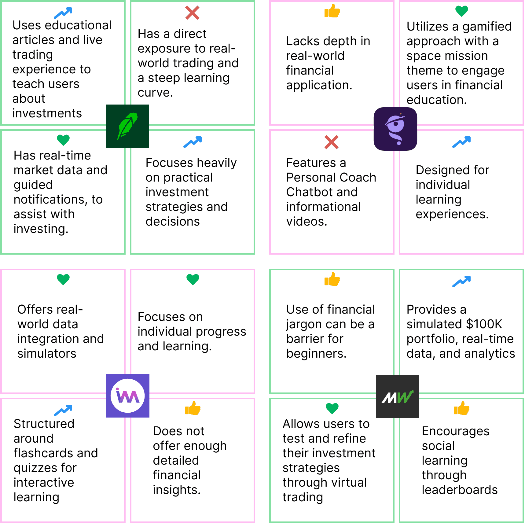
Since the pain points were identified and possible solutions were provided in the above categories, the next step was to understand how these pain points were handled in the market currently. So 4 competitors were analysed in these 4 areas.
Competitors - The good and bad
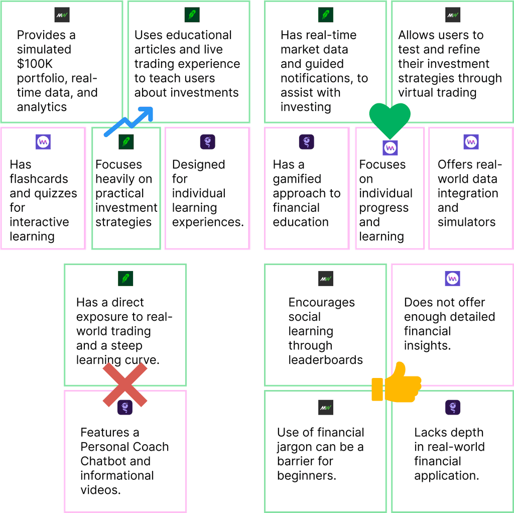
This analysis is organized into two main categories: first, by company, highlighting features that were deemed suitable or unsuitable for our app; and second, by feature, indicating whether they were considered or not considered for inclusion in our app.
The four symbols used represent:
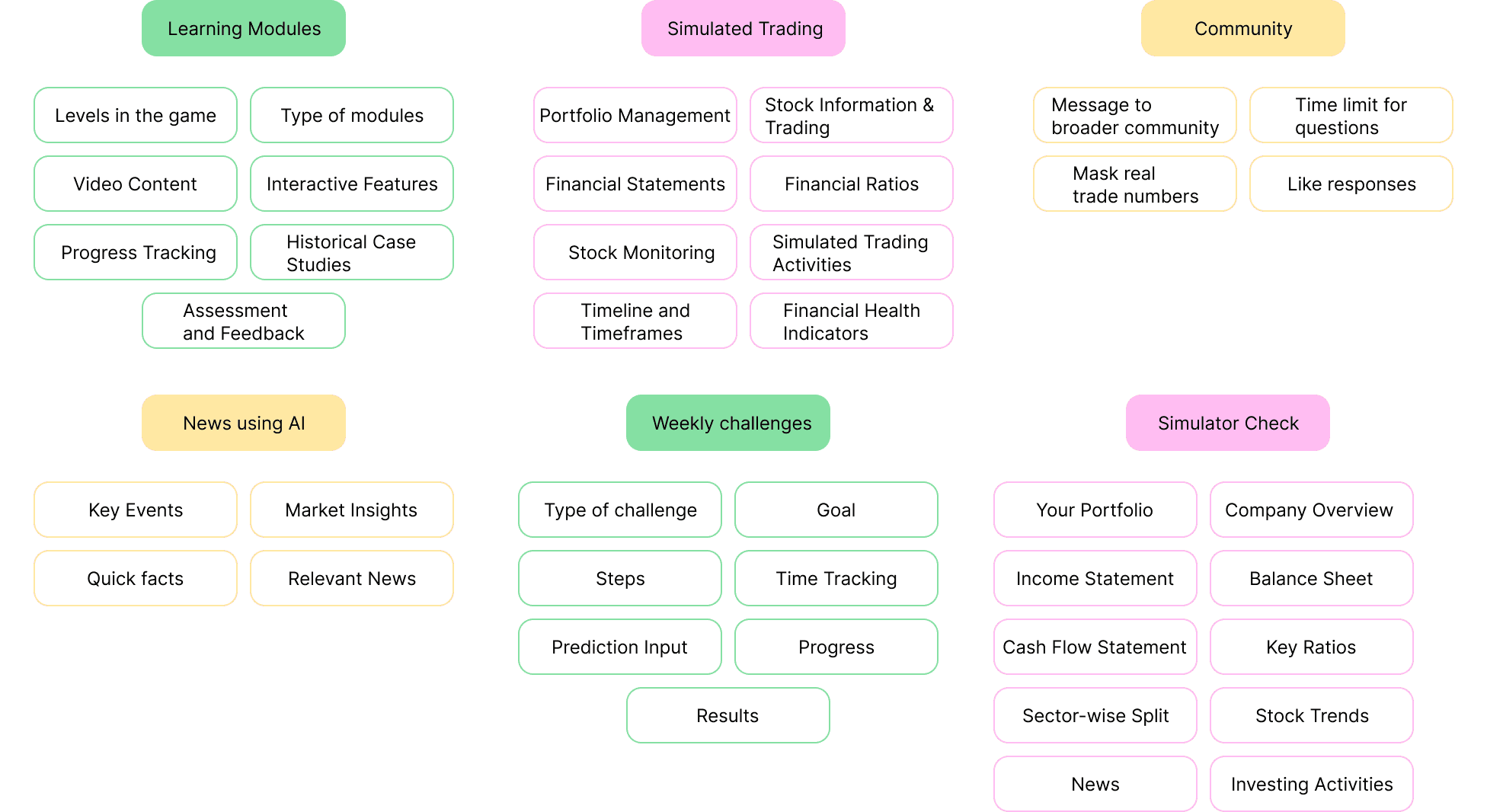
The features
Since this was an app with multiple data points, one main thing I always kept in mind was to make sure that no screen had an information overload.
Ideating on these features
The next step was understand the data points going into each feature.
Placing features on the screen
The next step was to map out the data points in such a way that the screens were not overloaded with information
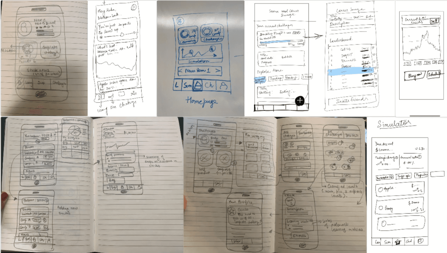
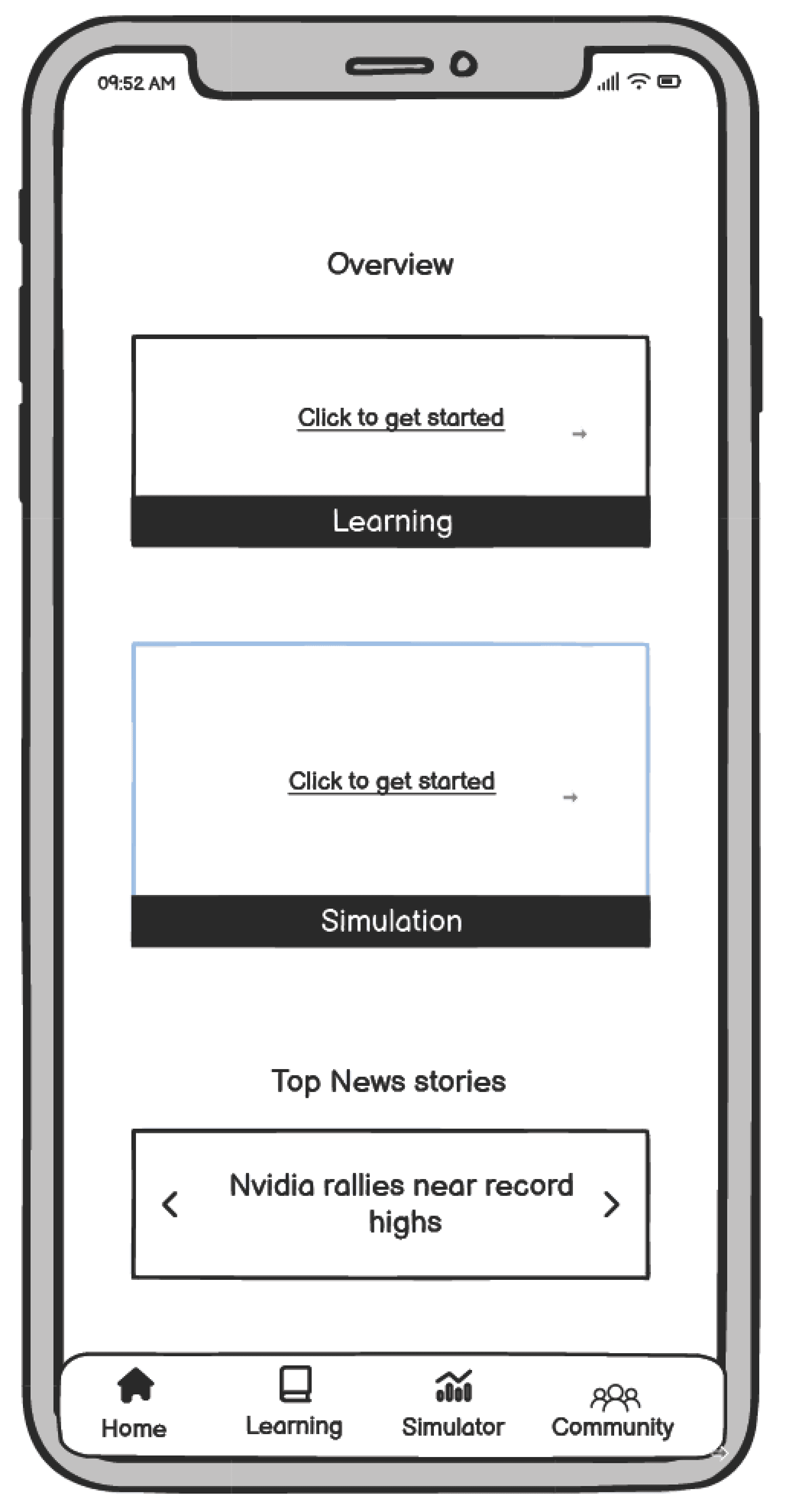
This was done by iterating on wireframes. The hand drawn wireframes below underwent multiple iterations to group data into sections that made the most sense.
Wireframes
The next step was to digitize the wireframes to understand exact spacing limitations and other workflow limitations.
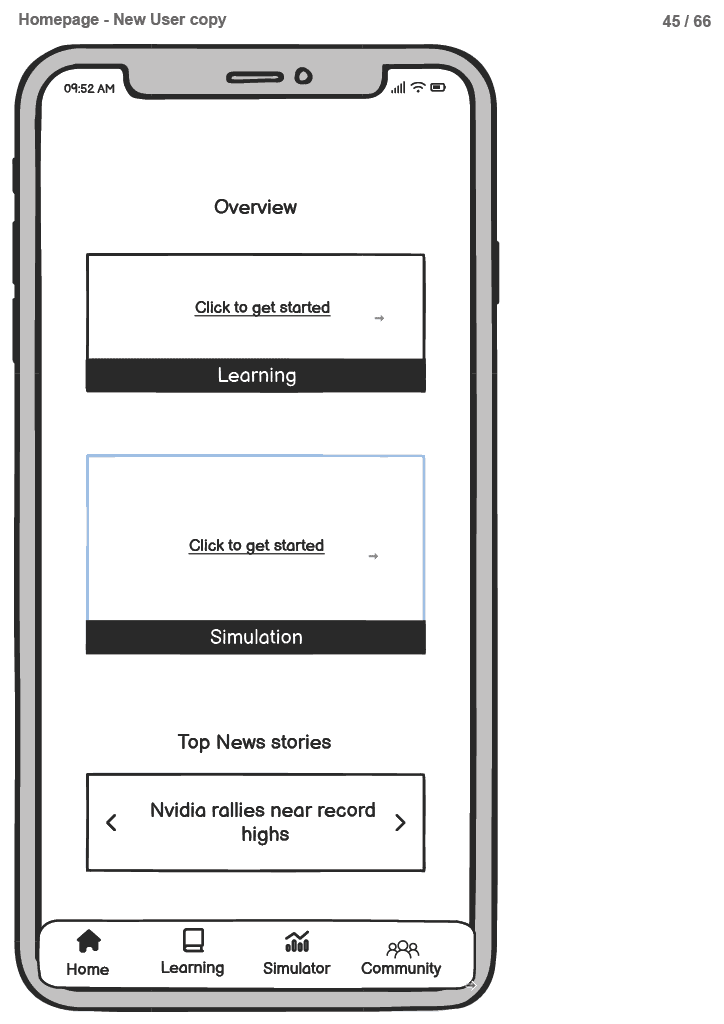
A part of the wireframes are shown below, the rest can be found at link
We understood it. But did others?
User tests were conducted with 8 users over zoom to test out the workflow. All users were presented with a fully prototyped version of the above wireframes and then were given 10 tasks each.
These tasks covered all the major features in parts and it revealed the following:
Issues Related to Navigation
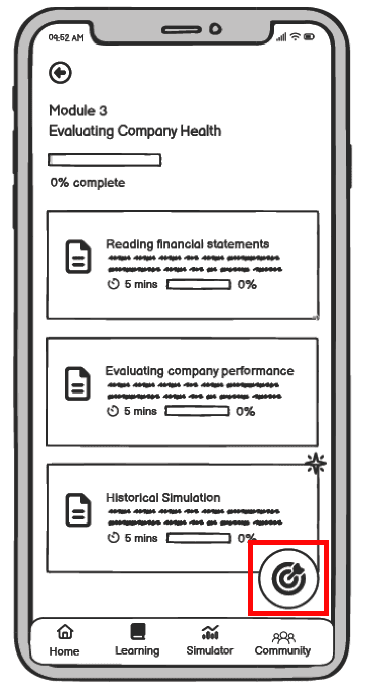
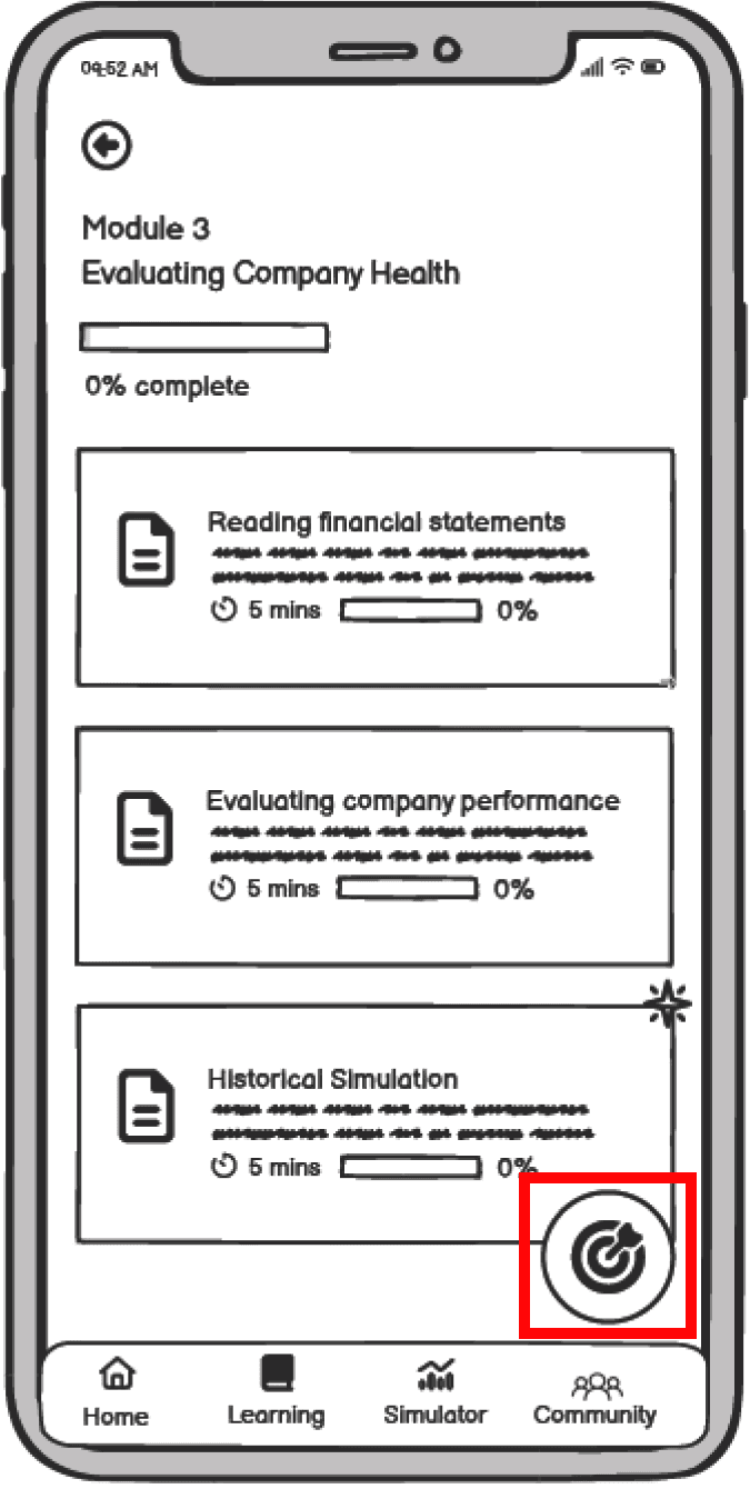
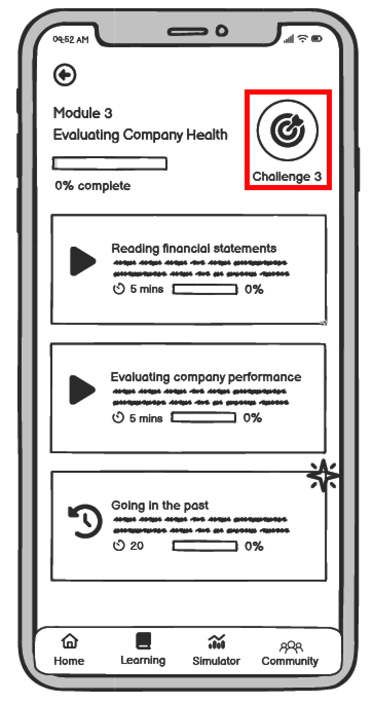
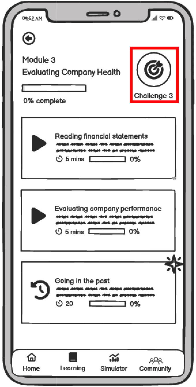
Issue 2: Users felt lost while navigating back from the historic simulation module.
Change: Link the submodules inside the main module by adding breadcrumbs, so that it becomes easier for the users to navigate through the modules without getting confused.
Issue 3: Users did not pay attention to the “guide me” toggle on the simulator screen. This made them feel a bit restricted if they did not want to go through so many screens to complete the trading.
Change: Need to make the distinction between guided and non-guided trading clearer.
Issues Related to Core Workflow Sections
Issues Related to Information Overload
Initial issues have been fixed! Moving on to some colors
Design System
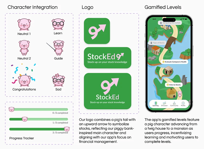
Our main objective was to make learning and practicing enjoyable for users through gamification. After brainstorming, we selected a pig as our mascot, symbolizing a piggy bank. As users progress in their learning journey, the pig upgrades to a new house.
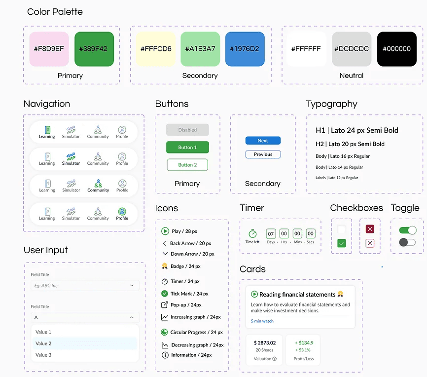
For our primary colors, we opted for pink and green; pink represents the pig while green signifies the dollar bill. We chose the "Lato" font for its elegance and readability. Although we followed a 4-point grid system, we encountered challenges with text sizes in the mobile interface. To address this issue, we occasionally used a 14px font size, deviating from the 4-point grid system.
Branding
Addressing some more issues
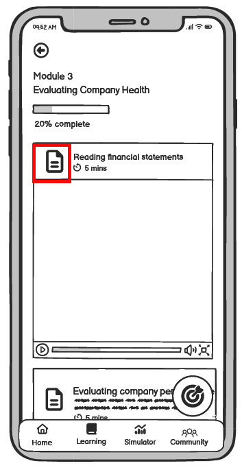
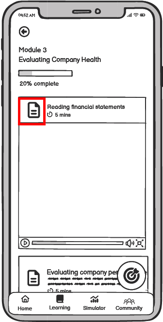
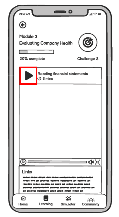
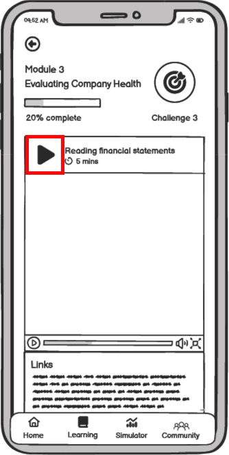
A second round of testing was done to the high fidelity prototype and below are the changes made:
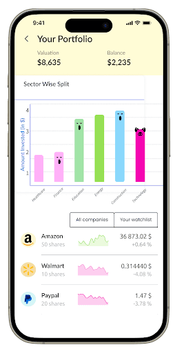
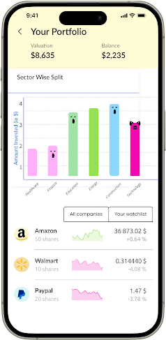
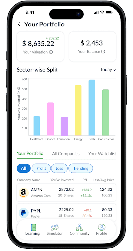
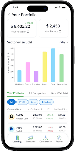
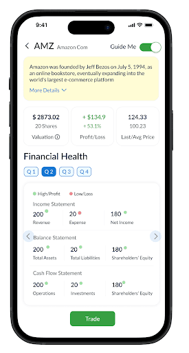
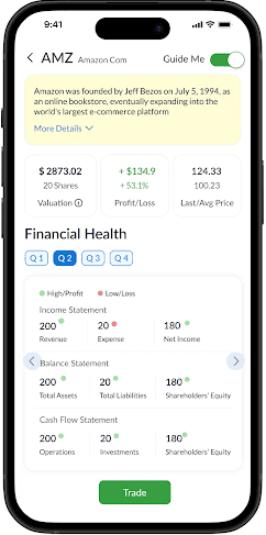
More details to individual stocks
Less Redundant Tags
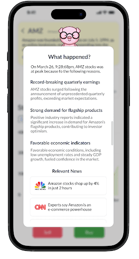
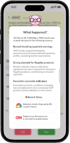
Reduce news content for a page
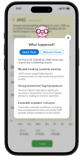
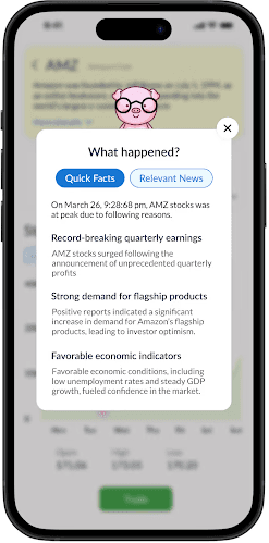
Modifications were made to reduce the amount of information shown to users, at one time, within the AI feature of the app. ‘Facts’ and ‘News’ were separated out into different tabs.
Final Wireframes
AI flow
As users explore company trends, they can click on highlighted points on the screen to generate AI-driven insights about specific stock events at those times. This feature enhances access to detailed data on stock trends for companies without them having to look up at different sources to make their trading decisions.
Challenges
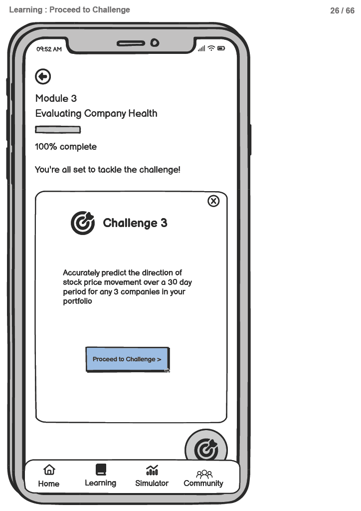
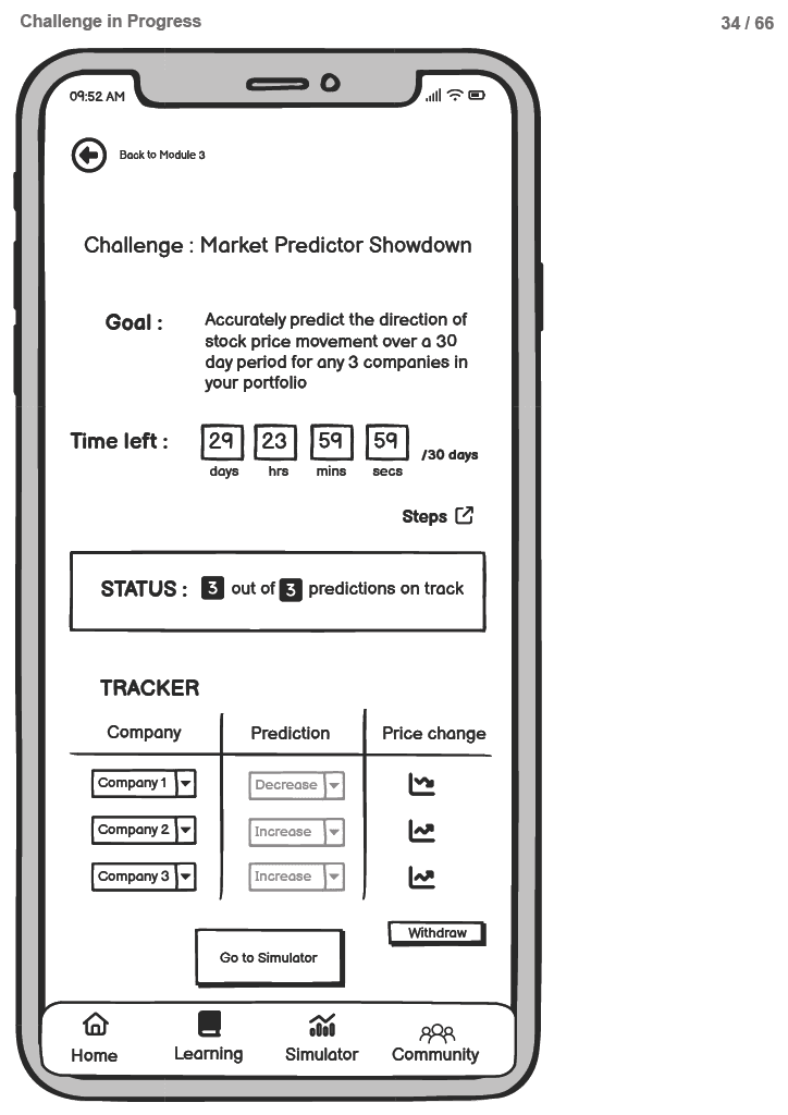
To advance in the learning journey and access higher levels, users must complete a series of challenges that start simple and progressively become more difficult as they level up.
Onboarding
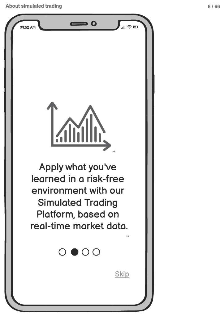
Its important that the onboarding process gives the users an idea of whats to come. Most users did not want to sign up for an app blindly without having an idea about its core features.
Learning
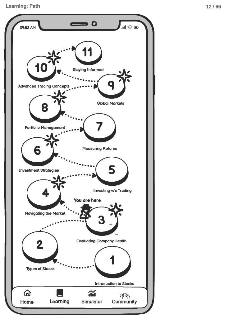
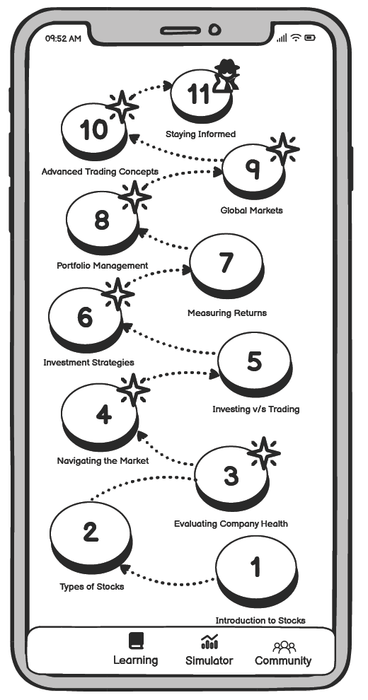
The learning screen includes 11 levels where users learn about stocks and investments through challenges specific to each module. As users complete levels, they earn upgrades to larger houses, as depicted below. This gamified approach not only makes learning fun but also allows users to earn rewards as they progress.
Each level of our learning modules includes a "Learn from the Past" section, where users explore significant historical events. This feature provides a hands-on opportunity to apply concepts learned in the module and gain insights from past mistakes.
Simulator
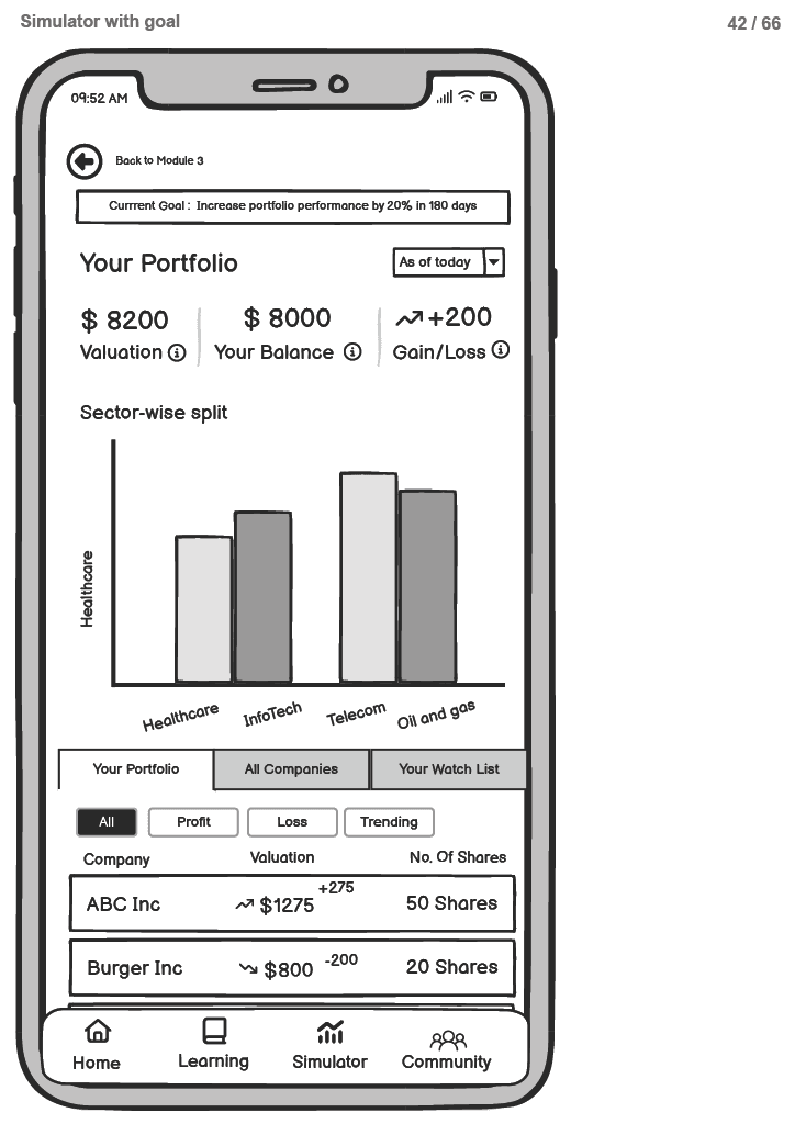
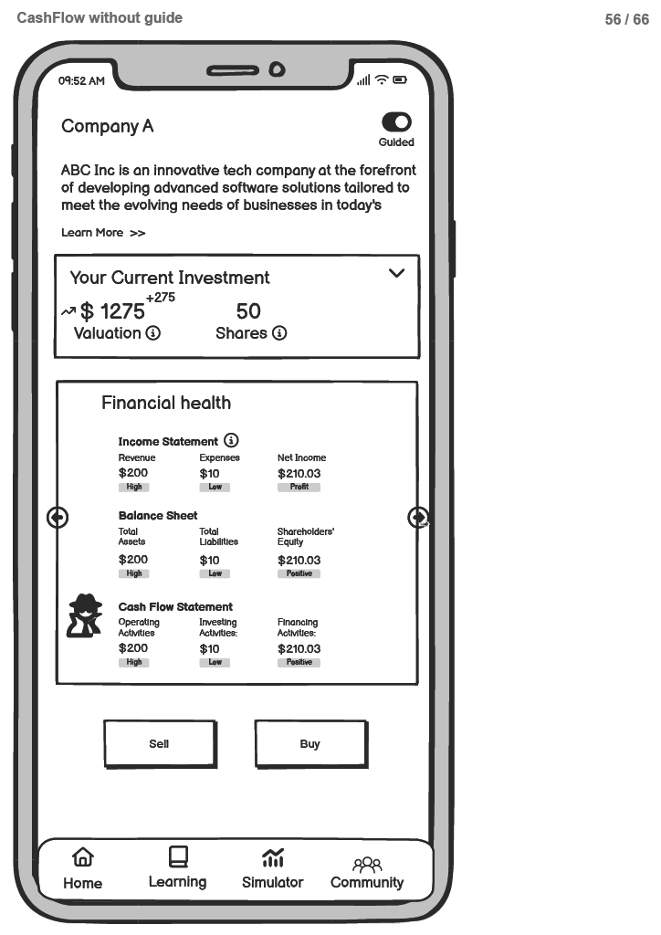
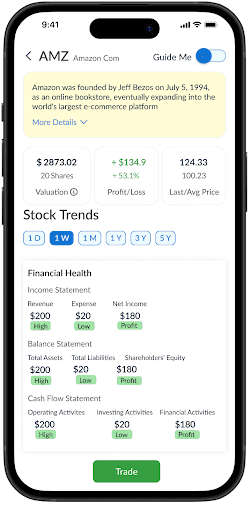
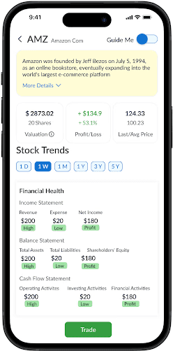
Users also get to explore real stock market data, analyze company trends, and trade stocks risk-free using virtual funds. The app provides them with a $10,000 virtual budget and they can build their portfolio from scratch, honing their investment skills throughout the process.
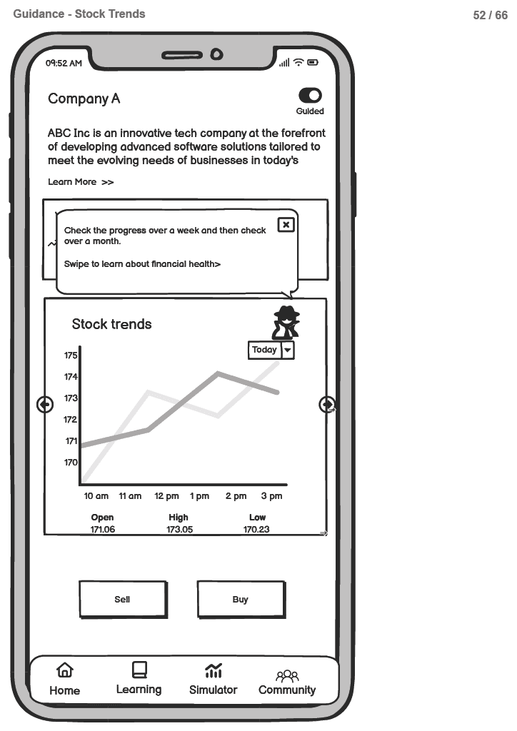
Users can activate the "guide me" trading option, where the pig mascot leads them through the simulator. By clicking on various terms, users receive explanations from the mascot about each data point and its relevance to trading decisions.
Impact
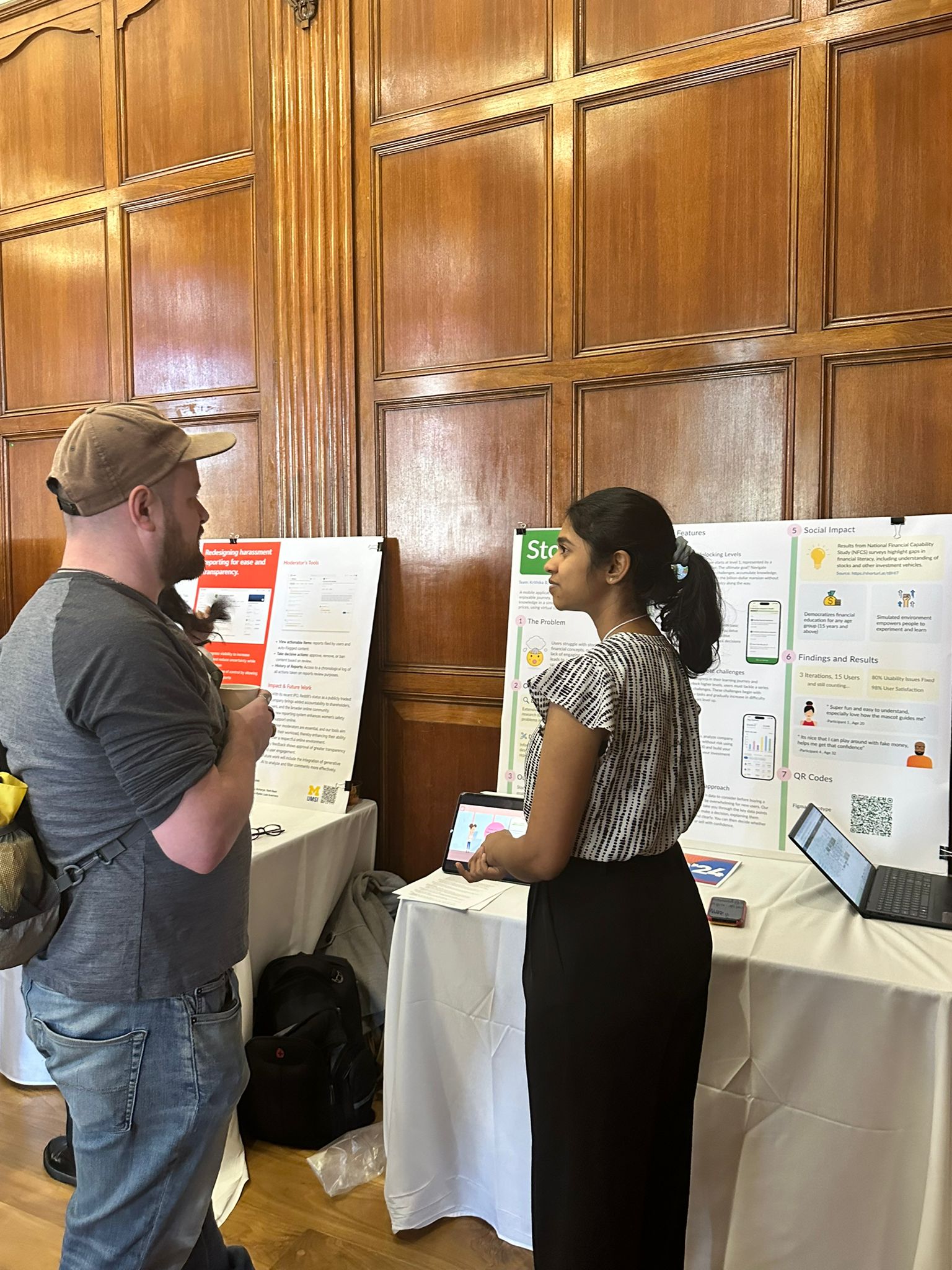
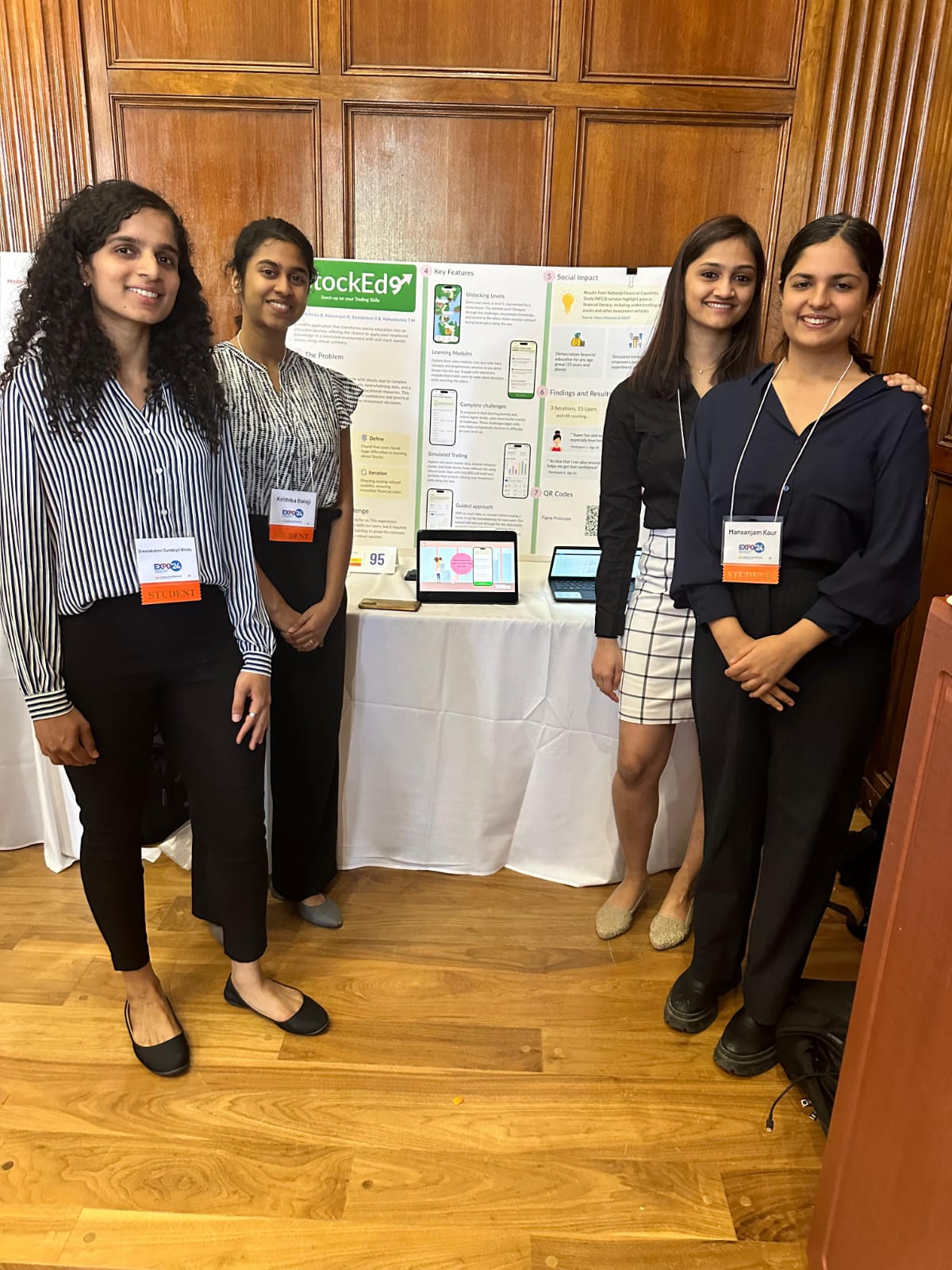
We presented our App at the University of Michigan Design Exposition 2024. We got a lot of positive feedback from many of the judges.
"I wish I had an app like this when I was learning about Stocks! Sure would have been more interesting!"
- Judge 2
"This app has a lot of potential and it can be a big hit if its monetized the right way! "
- Judge 5
Key Takeways
Prioritizing features and tasks is crucial, as the core functionality of the app depends on it.
While gathering insights from primary users is essential for understanding their pain points, it’s equally important to engage with users who possess deeper domain knowledge.
Testing with users should be integrated at every stage of the design cycle to ensure that design decisions remain aligned with user needs and don’t deviate too far from the intended goals.

